Corona 3D Environment
Mahdi Davoodikakhki
Prof. Steve DiPaola
Prof. Chris Shaw
Introduction
This project is written amid the pandemic to show the different statistics regarding the virus spread and the fatalities and encourage people to stay at home. Moreover, the users will be able to compare up to 10 different countries in overcoming the virus challenges by adding or removing them to the plots.
The 2D plots could be hard to understand and with having multiple of these plots it is hard to compare subjects with different criteria. With 3D plots, users can see several of these plots in one view or focus only on one of them. They can also hide or unhide the legends with a press of a button.
Project Description
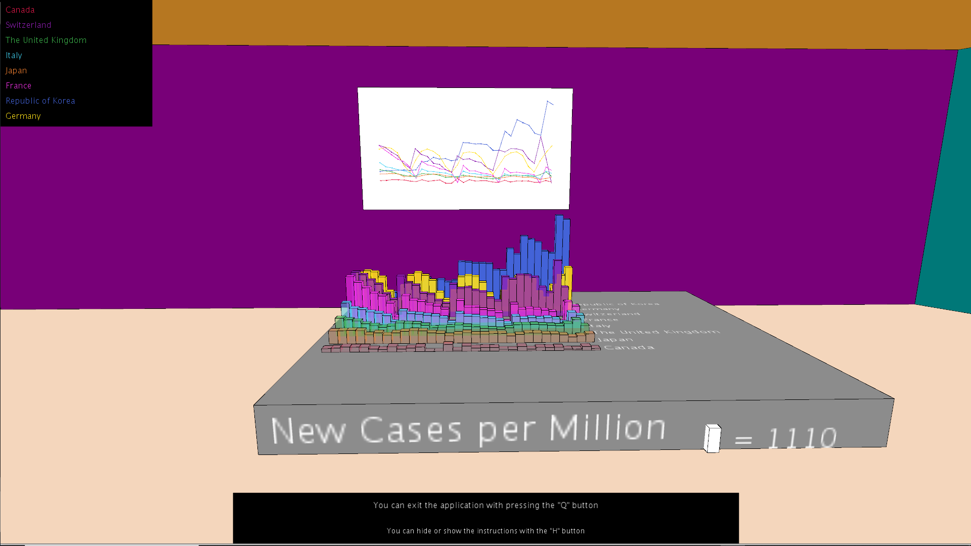
We have designed a 3D environment having six 3D plots showing New Cases, New Cases per million, New Deaths, New Deaths per million, Cumulative Cases, and Cumulative Deats for the last 30 days.
In addition, there is also a flat-screen that you can add or remove countries to the 3D plots. The users can freely explore the environment by walking around the room with the keyboard buttons.
The users can also choose to look at 2D graphs by pressing the 'G' buttons, which changes the image posters behind the 3D plots in the environment into the 2D graphs showing the same data.
Key Features
The key features in this project are having 3D and 2D plots, adding or removing countries, and walking around the environment to see and focus on different types of data.
Implementing the Project
We have implemented the project using Processing software and Java programming languages to create our 3D world and objects. We sort the countries based on the mean of their data and put the countries with the largest values in the last rows and the lowest ones in the first rows to help the users see the data easier.
We also used transparent materials for the plots to let the users see through the data plot columns. This could be helpful if there is any smaller column behind the columns closer to the users.
Every time the code starts running we will download the recent COVID spread data from [1] and we will use the 2019 world population prospects for having a fair comparison between countries.
Detailed workflow
We implemented our project in five phases. We first created the room, which has 6 walls, a floor, a ceiling, and the base objects for the 3D plots. There is also a place for the posters on each wall.
For the second phase, we implemented the functions for downloading and reading the up-to-date Covid data and the countries population. In the next phase, we focused on moving the camera around the room and showing 3D and 2D plots.
For the fourth phase, we added the feature that lets the user add or remove countries by implementing the mouse ray and plane collisions. For the last phase, we focused on bringing images, adding legends, and adding sounds to the project to improve the user experience.
We implemented the project in two weeks in November and December 2020.
Demo
Here, you can see a short demo of our Coronavirus data visualization demo.
Future work
For the future work, we would like to implement our project for a VR headset to improve the user experience and interaction. We would also like to add textures and other objects such as actual light objects to improve the environment aestethics. In addition, we could have more than 20 countries to let the users choose from them.
References
[1]. WHO COVID 19 global data, https://covid19.who.int/WHO-COVID-19-global-data.csv , accessed on: December 12 2020
[2]. United Nations World Population Prospects 2019, https://population.un.org/wpp/Download/Standard/CSV/ , accessed on: December 12 2020